The Colour Psychology of Home Decor: How Hues Affect Your Mood
The colour psychology of home decor is a fascinating exploration of how different hues can influence our emotions and behaviour. In home decor, choosing colours is not just about aesthetics, it’s also about creating the right emotional resonance. Understanding the psychological impact of different colours can help you design spaces in your home that improve mood, influence thought and create a comforting and nurturing environment.
Here are some roles that different colours play:
Red
The rich shade of red resonates with enthusiasm, positioning it as a powerful option for areas that encourage momentum and engagement. Within home offices, this radiant hue kindles a spirit of ambition and resolve, curating a space primed for focus and motivation. Meanwhile, in shared spaces like the living room, red transforms into an agent for hearty discussions and bonding. Its inherent power to elicit emotions of ardour and vitality makes it adaptable to various facets of home life. With bold colours such as red, you can incorporate this shade in your space by adding furniture or textiles with colour. You can even hang wall art in shades of red to add a splash of this vibrant hue to keep it subtle.
Brown
A subtle shift from the intensity of red, brown embodies a natural sophistication by merging modernity with earthy tones. When paired with neutrals like beige, off-white, and gray, it curates a tranquil ambiance, exuding feelings of security and steadfastness. While brown’s rustic undertones bring depth and serenity, pairing brown with neutral and vibrant hues holds great significance because brown on its own can lead to feelings of indifference. Given its ability to elevate compact spaces, brown shines particularly in kitchens and bathrooms, giving them a touch of luxury. The most common way to incorporate this colour in your kitchen or bathroom is through cabinetry and accents.
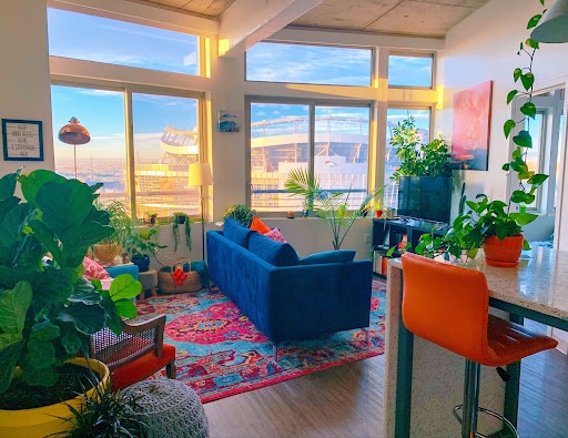
Blue
Blue, often hailed as the epitome of tranquillity, has a profound ability to calm the mind and alleviate tension. Its aquatic shades particularly offer therapeutic effects reminiscent of serene seas and inviting pools. Its versatility in home decor is unmatched, suitable for any space seeking a touch of serenity. Yet, when one ventures into its deeper tones, blue transforms, echoing sentiments of regal elegance and opulence. A plush couch in royal or dark blue can bridge the gap between contemporary and industrial aesthetics, cementing blue’s place as a multifaceted and adaptable shade in interior design.
Black & Grey
Black and grey are synonymous with sophistication and refined taste in the realm of interior design. Black, in its understated brilliance, epitomises simplicity and practicality, while grey seamlessly complements contemporary architectural nuances. As pillars of design philosophies like minimalism and Japandi, these hues deliver a streamlined and muted elegance, ensuring spaces don’t feel overpowering. With these shades, the strategic integration of gold or silver accents and vibrant colour splashes can elevate a space, blending modernity with timeless grace.
Green
Green, deeply rooted in nature, breathes life into spaces with its invigorating aura, echoing feelings of growth, vitality, and renewal. This colour inspires sentiments of safety and security, further permeating rooms with a sense of peace, trust, and tranquillity. Its therapeutic properties have the added advantage of relaxing the senses and helping reduce hypertension. The easiest way to add a splash of green to your home is by incorporating plants, which in itself has a plethora of benefits. Shades like light green and aqua are know to excuse calmness, which can be included through furniture, textiles, or wall art. On the other hand, olive green stands as a universal symbol of peac and harmony, making it another cherished choice in home decor.
White
White, a hue known to exude feelings of serenity and calmness, is a favoured choice in spa settings, as well as in Japanese and Scandinavian design aesthetics. Its pure and unblemished nature serves as a versatile backdrop, inviting individuals to imprint their unique stylistic touch. Beyond its aesthetic appeal, white possesses the ability to amplify the sense of spaciousness and purity in a room. Its soothing essence can help mitigate feelings of anxiety and hypertension, making it an adaptable shade suitable for every corner of a home.
Remember to have fun with the exciting journey of incorporating colours into your home! And if you require professional help, don’t shy away from getting in touch with us here.